This post is part 1 of the "Introduction to Pricing and Pathological Demand" series:
- Pathological demand in ridesharing - confounding with demand
- Pathological demand with flights - using instrumental variables
Introduction
During the training steps, machine learning models learn how the features (or inputs) are correlated with the target variable you are trying to predict. If you are just trying to make predictions, without driving the inputs, then the difference between correlation and causation isn't important.
As argued in a previous article, often one of the goals (if not the goal) of a data science project is to identify what features our prediction is sensitive to, and inform how we should change our business practices. This approach only works if our correlations are causal. As a simple example, when looking at ice-cream sales, we might find
- Temperature is positively correlated with ice-cream sales in a city
- The number of cars is positively correlated with ice-cream sales in a city
The first relationship is (likely) causal; more people seek out cold foods on hot days. Our business cannot do much to control the temperature, so this insight isn''t that useful. The second relationship is not causal; the number of cars is positively correlated with the population of the city, as is the amount of ice-cream consumed. Introducing more people would increase the number of cars and amount of ice-cream consumed, but just bringing more cars into the city would not have the desired effect of boosting ice-cream sales.
This article looks at a relatively common occurance of pathological demand, where when we find a positive correlation between price and number of sales. For example, hotel rooms have wildly varying demand, and hotels change their prices according to what they forecast demand to be. If we looked at price of room against bookings, we would see more rooms getting booked as the price increased. The bookings don't because the prices go up, we are seeing this relationship because we demand for the rooms is highest when the prices are highest.
We don't want to compare the high number of bookings for a $\text{\$}$300/night room on labor day weekend, to the low number of books at $\text{\$}$80/night room in the first weekend of February, and use that to conclude we should raise prices. What we want is an estimate of how many bookings we would make if we charged a different price on labor day weekend (with a similar analysis for our $80/night price for the first weekend of February).
This is an example of Simpson's paradox, where we see a (pathological) postitive correlation between price and bookings if we ignore demand, but a (expected) negative correlation if we control for demand. We'll look at two different examples of how to estimate the effect of changing the price:
- Ridesharing apps: where we can measure demand, and control for it (this article)
- Flight bookings: using instrumental variables (next article in series)
Ridesharing
Let's simulate some ridesharing data. For the moment, we will eliminate (important!) variables such as distance traveled. We will control our app through surge pricing, by charging a lot when lots of people are demanding rides, which we can use to encourage more drivers out.
- There is an external demand, which is in dollars, which measures the amount a typical customer is willing to pay for a ride.
- When demand is high, more users open the app to check the price of the ride.
- After seeing the price, the customer decides whether or not to take the ride.
When the demand is $\text{\$}$10, there are fewer people opening the app and requesting rides, compared to when the demand is $\text{\$}$20. We will write a function for whether or not the customer accepts the ride.
def does_accept_ride(demand, price_shown):
    auto_accept = demand
    threshold = np.exp(-(price_shown - auto_accept)/(0.8*demand))
    return np.random.rand() < threshold
We can see that if the price is less than the demand, the customer accepts. As the price goes above demand, the probability of accepting drops off exponentially:
The piece that is directly under the ridesharing companies control is how much they choose to charge for a given ride. The company charges more as demand increases, and there is some noise as well.
MIN_PRICE = 5

def simulate_single_customer(day, demand):
    price_shown = max(MIN_PRICE, MIN_PRICE + 0.95*demand + 0.1*demand*np.random.normal())
    is_accepted = does_accept_ride(demand, price_shown)
    return {'day': day, 'demand': demand, 'price_shown': price_shown,
            'is_accepted': is_accepted, 'payment': is_accepted * price_shown}
We can then generate some demand data, and some client requests, for a year. In this simple model, we make more customers make requests when demand is higher, and assume that demand is constant across the day.
np.random.seed(42)

# demand on each of the 365 days, in terms of average amount a
# customer is willing to pay
external_demand = stats.gamma(loc=0, a=5, scale=5).rvs(365)

simulated_data = []

for day, demand in enumerate(external_demand):
    num_decide_to_go = stats.poisson(mu=10*demand).rvs(1)[0]
    for _ in range(num_decide_to_go):
        simulated_data.append(simulate_single_customer(day, demand))

simulated_df = pd.DataFrame(simulated_data)
Let's see what the external demand looks like:
How do number of rides change with price?
We can see a very strong relationship: as the price increases, so do the number of rides. This is because we see more customers when demand is high and that people are willing to pay more when demand is high.
It makes sense if more people are looking for rides when demand is high that we see more rides on those days.
Cancellations vs price?
What about the people that cancelled their rides? Perhaps we can see higher cancellation rates we sa price goes up? Even in this case, we see that as price goes up, the percentage of rides goes up.
In graphical form:
Accounting for demand
The reason we are seeing this weird behavior is that demand affects both demand and price. If we look at grouping days with a specific number of demand (or, if that cannot be measured directly, the number of clients coming in on a single day) then we aren't running into the problem where we are comparing people's willingness to pay on a busy Friday when a concert is in town to a sleepy Tuesday. Instead, we are comparing prices on days that are like each other.
Let's bin the demand in units of $\text{\$}$5, and compare what happens to the fraction of rides accepted at that demand and price point. We leave cells blank where we don't have any data.
We see, at a given level of demand, increasing the price leads to a decrease in the number of accepted rides.
What we really want to do is compare what actually happened to what would have happened if we had set the prices differently. This is different from seeing the days where we set the prices high and comparing them to days where we set the prices low (we don't want to compare Tuesdays and Fridays!)
How applicable is this to real ridesharing?
For real ridesharing apps, the prices are being set in real time in response to customer demand. If we need more drivers to cope with existing demand, we might need to bump prices up a little bit. Not enough riders? Try decreasing the prices. Because this is being done in real time, we are implicitly comparing "like-demands", as demand changes somewhat slowly.
This type of analysis would be much more important if, as a company, we were trying to predict what would happen if we paid drivers more, or were launching different coupons for customers.
There are some other issues to consider when designing pricing experiments in real ridesharing apps, such as interference, where exposure of a treatment to one subject can affect people not exposed to the treatment. A really nice example is discussed in Lyft's pricing experiment blog post.
A Counterfactual
We also had the complete method for generating the data to hand as well. A couple of interesting things to do with the analysis is to
- increase prices by some amount (e.g. 10%) and see what happens to the number of rides metric.
- shuffle the prices shown, so the prices have the same overall distribution, and see what would happen the number of rides metric.
This gives a better idea of what would happen. I'll do the second one (shuffling) to show how it works, but didn't include it above, as if we know the underlying data generation process we don't actually need to do analysis of data -- the model gives us a precise prediction of what would happen. When performing an analysis, you generally don't have access to the geneartion process!
What does it mean to shuffle data? We are going to pretend we used the exact same set of prices, but instead of showing them to the customers we did (where we showed higher prices when demand was high), we are going to show them the prices randomly. We then need to calculate whether or not the customer would have accepted the ride at this new price. This is why we need a good model: because the customer didn't actually see this price, we cannot look at the data to see what they did; instead we need to use our model to see what they would have done if we offered them this price instead.
This dataset, called the counterfactual, has the price now no longer related to demand, and when we look at price vs number of bookings, we will see a negative correlation. Now to see it in code:
counterfactual_df = simulated_df.copy()

# shuffle prices
counterfactual_df['price_shown'] = np.random.permutation(counterfactual_df['price_shown'])
# do they accept the ride at this demand, and this price?
counterfactual_df['is_accepted'] = (counterfactual_df
                                    .apply(lambda row: does_accept_ride(row.demand, row.price_shown),
                                          axis=1)
                                   )
counterfactual_df['payment'] = counterfactual_df['is_accepted'] * counterfactual_df['price_shown']
Without doing any bucketing, we can look at the correlation coefficient between price and fraction of accepted trips of $-0.41$. By bucketing by price shown, we see a strong and clear decrease of number of accepted trips as price increases.
It is important that in this example, we generated the data and therefore had access to the exact model that was used (i.e. we knew how the customer would respond in changes to price). If we were doing this analysis on real data, we wouldn't have this technique available unless we had estimated a causal model.
This model is shown to illustrate that it is the correelation of the prices and demand that causes the issue, rather than a suggestion for how you would do this analysis yourself with purely observational data.
Visualizing causal relationships
When making arguments about what are causal relations (i.e. changing X should change Y), and what are just correlations, it is often valuable to visualize the flow of information. We draw a node for each variable, and an arrow from X to Y if we think that changing $X$ directly leads to a change in Y. These visualizations are a type of graph, specifically a directed acyclic graph (DAG).
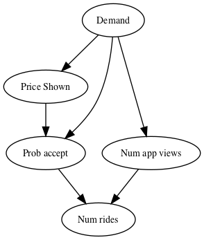
If we are looking at the number of rides taken, we see that demand changes the number of people that will open teh app, the price that the ridesharing company will show, and the probability that someone will accept the ride alongside the price. This helps someone realize if they want to know what the effect of changing the price is, we should do so in a way that keeps the demand constant.
The rules about what to keep constant, and what to allow to vary, are the subject of causal analysis. In a nutshell, causal analysis is supposed to help us distinguish between information that is due to correlation, and find which relationships are truely causal.
Summary
This article looked at a hypothetical ridesharing application. Looking at the data, we found
- As price increased, more rides were booked
- As price increased, a higher proportion of rides were accepted
When setting a price policy, what we would ideally like to do is ask:
For this particular customer, how likely are they to book a ride if offered at price $p$
That is often a tricky question to answer, because we only get to show a customer one price. If we think the only thing other than price that changes the liklihood of booking a ride is demand, then we can treat all customers at the same level of demand as interchangable.
Once controlling for demand, we see the usual relationship: as price increases, the chance of an individual booking a ride decreases, and hence the total number of rides decrease.
- Fundamentals of economics tell us that as price increases, quantity consumed goes down (the law of supply-and-demand).
- If demand shifts, however, we expect to see more consumed at the same price.
- In industries where demand shifts a lot, we will often see a pattern in observational data where higher prices lead to more purchases, because both are driven by increased demand.
- We should be careful not to recommend price increases and expect ride numbers to go up. Even though in observed data, higher prices lead to high ride bookings, if we had charged higher prices we would have fewer bookings. Increasing the price doesn't also increase the demand, or amount people are willing to pay.
- This is a specific example of a more general result known as Simpon's paradox.
- When controlling for demand, we see that increasing price leads to decreased sales.
- We can also use observational data to estimate how the probability of getting a ride drops as we increase price at the different demand levels, as we did when accounting for demand.
- In ride-sharing, we can measure the number of times the app is opened even if a booking is not made, so we can estimate demand. In the flight booking example, we will show the instrumental variable technique instead.
- If we know the decision making process, we can model the counterfactual: what would happen if we had different policies in place (e.g. we randomly allocted the exact same set of prices). We cannot just use an off the shelf machine learning package, we have to construct a causal model. Details on how to construct causal models will be in a different article.
Acknowledgements
Thanks to Vivien Tsao and Joyce Lee for participating in discussion about this problem, after reviewing the flight example in Business Data Science.
Resources
- "Business Data Science" (M. Taddy), chapter 5 on experimentation introduces the idea of pathological demand.
- Causal Estimation lectuers for CMU's Advanced Analytics class has a section introducing instrumental variables
- "Goodhart's Law", on choosing appropriate metrics (rather than ones correlated with your goal).
- "Simpson's Paradox"
- "Experimentation in a ridesharing marketplace" on Lyft's blog. Demonstrates how effect sizes are skewed in poor experimental design.